NEW FEATURE: Site Visual Themes & poll

Visual ā€˜Themesā€™ for the forum

These change the way the forum looks.

Iā€™ve added several optional themes to make the site easier to read or make your experience more interesting.

These can be selected:

  • From the ā€˜hamburgerā€™ menu (the three horizontal lines) at the top right in the middle (quickest method)

  • From user Preferences under Interface (Remember to hit ā€˜Saveā€™)

(beware the ā€˜Material Designā€™ theme moves and changes the ā€˜new topicā€™ button on desktop/tablet)

There are two dark themes and ones offering larger fonts.

Enjoy

James

Iā€™ve added a new dark-style theme today which I love ā€¦ its called ā€˜MV Vincentā€™. Try it! Itā€™s very easy on the eye, to me.

And on that topic, which Theme do you think I should set the site to as default, so all new users are presented with that theme at first?:

  • Current Default Theme
  • Dark Theme
  • Larger Fonts
  • Larger Fonts Dark
  • Material Design Theme
  • MV Vincent

0 voters

(this is just for fun, I may not follow the most popular choice)

Youā€™re funny!

Well look what happened with Brexit! :wink:

Umm, I live on the Left coast. Weā€™re all very embarrassed and disappointed Canada doesnā€™t want us.

Can you point please me to a good article that describes this split?

IT challenged here, James - how do I get this option please?? Just clicking on it saves it as a pictureā€¦

As per instructions in first post Beth (have added a screen grab to make it more obvious)

:confounded: 
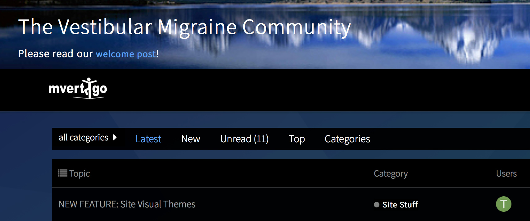
Sorry!!! The post opened with the screen shot of the dark page, and I didā€™nt scroll up to see first post!! Thank you. Will give this a whirl and see how it works for me! Looking good so farā€¦:blush: Thank you for the work you put into the site!

1 Like

Probably could, but wonā€™t. Iā€™ve sworn off talking politics until the world looks less like a Bizarro comic.

3 Likes

Those really dark themes are just too dark for me. But sometimes the white backgrounds are too bright.

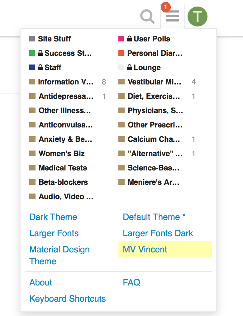
I hate to ask this, James, because you have already done a tremendous amount of work here, but are there any themes that are in-between? Say with a background that is a light to medium color, such as a muted blue or green?

1 Like

Or some kind of beige manuscript/papyrus? muted blue or green might come across a bit 90ā€™s web? I might be able to offer the options though ā€¦ let me have a look at this the next time I sit down to look at Themes

Oh, sure, that would be nice. Something that tones down the contrast a little bit. I thought I might find a site full of themes but I donā€™t seem to be able to do so. Hereā€™s one that is sort of like what I was imagining, but Iā€™d lose the lavender sidebarā€¦ :slight_smile:

https://discourse.omnigroup.com/t/theme-newantiglarecolortext/32446

Being pushy hereā€¦perhaps also available in the bigger font???:star_struck:

@Manatee, @mazzy, your wishes are granted, Iā€™ve added:

  • ā€œCream Themeā€ (quite possibly my new favourite) and ā€¦
  • ā€œExtra Creamyā€ (same with larger fonts :wink: )

ā€¦ respectively ā€¦ let me know if you have any issues ā€¦

Enjoy :slight_smile:

Iā€™m almost tempted to work on an ā€œFT Pinkā€ one next ā€¦ but hopefully thatā€™s enough for now to suit most peopleā€™s tastes and circumstances ā€¦

PS I"ve also noted the results of the poll. Seems most of those whoā€™ve responded above are happy with the current choice of default theme. I shall leave it alone
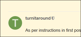
 :slight_smile:

Iā€™ll go check them out!

ā€œExtra Creamyā€¦ā€ OK, now Iā€™m hungry for ice cream. :slight_smile:

Iā€™m using ā€œCream Themeā€ now. My only observation is that the dividing lines between posts are hard to see (theyā€™re a light gray and they blend in with the cream). Hereā€™s a screen shot that shows a dividing line above a post:

image

Are you sure, I thought you wanted less contrast?

Iā€™ve changed it to a dark grey line (black was OTT) on desktop.

Not less contrast, just less white for the background. :slight_smile:

Thank you so much - these themes are all wonderful!

1 Like